Monday, 30 March 2015

Music Video Director's Commentary (with script)


Script:

Song/ Artist: 'Good Girls'- 5 Seconds of Summer

Created by: Hana, Chloe and Taslima

0:00- 0: 31 seconds:
Scene: Girl in the bedroom getting ready
(Introduce group) The video beginning is set in the girls bedroom. We wanted to create a girly atmosphere and show shots of different items in her room so that it can relate to our teenage girl audience and almost 'welcome' them. To keep to the upbeat rhythm we changed the shots often.

0:31- 0:50 seconds:
Scene: Girl sneaking out house and meeting with her boyfriend
We decided that the actress should sneak out of the door instead of the window due to safety reasons. We show a wide mid shot of the boy whilst he waits to emphasize his loneliness without the girl. Then to add to the effect more when the girl comes the shot is close up as she walks. It almost looks slow motion which gives further impact. The shot is wide again as soon as the couple embrace each other. The shot shows the back of the boy and the girls face as she winks.This expresses her secret bad girl attitude. The shot of the couple is wide and then there is another shot is closer as they get physically closer. This gives a closer more intimate feel for the audience.

0:50- 1:04 minutes:
Scene: Girl studying in the library. The boy walks in and they meet.
A mid shot of the girl studying followed by a behind the shoulder close up of her 'study book' was shown to show the audience that she is not studying but drawing. This again expresses the bad girl behavior that we wanted to subtly imply throughout the video. A mid shot was used for the boys entrance to almost slow down his movement in contrast to the song to give a 'grand entrance' feel. 

1:06- 1:08 minutes: 
Scene: Hand to camera. 
As the couple covers the camera with their hand, we added a distorted effect on final cut pro to look as if the tape got damaged.

1:11- 1:17 minutes:
Scene: At the library, hidden behind a book.
A wide shot was used to show the couple mischievously hiding behind a book. We placed a bookshelf behind them to emphasize the school setting and add colour to the shot. The shot adds 
humour to the video. 

1:20- 1:33 minutes:
Scene: At the back of the school/ Grease interextuality
We chose to shoot this scene besides an edgy background to reflect the rebellious attitude. The body language and behavior in this part was influenced by a scene from 'Grease', which also connotes a similar meaning as the song. This creates entertainment. 

1:33- 1:41 minutes:
Scene: Park documentary/ Self footage.
To engage the audience further we included self footage that the couple took. This is entertaining to watch as we get to know them more personally. To make it obvious that they are self footage, the quality is different to the other scenes. The shots (of the boy) here are almost similar to how fashion adverts are shot. It appeals to the audience and syncs to the beat of the music. 

1:46- 1:56 minutes: 
Scene: Photos
To suit the pace of this moment of the song, we decided to use photos. We added a frame on to the photos in final cut pro to make it look as if they are the couples own photos.

1:59- 2:06 minutes:
Scene: Girl putting on red lipstick
As the music builds up, we show different shots of the girl putting on dark red lipstick to connote romance and rebellious behavior as red is usually a colour used for warnings. The props were picked precisely, such as the heart shaped sunglasses, to look fun and appeal to the genre and audience. 

2:06- 2:40 minutes:
Scene: In Camden.
We establish the location with an iconic part of the area 'Camden Bridge'. The upbeat vibe and setting in Camden gave the shots a colourful and fun look as well as fit the music. It looks happy. The various shots show the couple together having fun. The shots change quick in able to look lively and engage the audience more. Again, there are more self footage shots to allow the audience to get more personal with the characters, 

2:47- 3:02 minutes:
Scene: Final shots/ White background.
We decided to film the final shots with a white background. The boy wears a red bandanna to fit into the cool rock genre of the song and to suit the girl. The couple carry on having fun and the action is sped up so that it feels more exciting and lively. Instead of text credits in the end we decided to show each crew member holding up a clapper board with their name on it.  


Thursday, 26 March 2015

Representations In Our Music Video

The target audience for our music video is primarily working class/ middle class young females, from the ages of 13- 19, who establish themselves within the pop genre. A majority of them would be from the UK, Australia and USA due to the popularity of the band in these countries. Our video will follow a narrative that is based on the lyrics, our visuals will match the lyrics. The narrative will be of a girl who appears to be a 'good girl' but is secretly a 'bad girl'; she's cheeky, rebellious and has a 'secret' boyfriend.

How will I use camera, mise- en- scene, editing and other elements to represent stereotypes and positive/ negative representations? 

Stereotypically, people assume that those who establish themselves within the pop genre are interested in the latest fashion and makeup, which we show through mise- en- scene in our video. In our video, the girl is seen in different costumes and applying makeup, such as dark lipstick, in the bathroom. We picked out clothes that our audience will be familiar with, as they would have probably seen it in a magazine as one of the latest trends. We used an iconic leather jacket and dark lipstick, to give the character an edgy side and to show her 'bad girl' side. We also used a bandana on the male character as this connotes that he is also a 'bad boy'. These are stereotypical images of a 'bad girl' and a 'bad boy'. To represent her 'good girl' side, we filmed her studying and wearing buttoned up shirts and skirt with props such as books. This is a stereotypical image of someone who is considered a good girl. This can be considered a negative representation as it can connote that 'good girls' are quite 'nerdy' and tend to study a lot. To create a positive representation of a good girl we showed that rather than studying in the library, she was doodling hearts in her book to show the audience that she is just like a regular teenage girl who tends to get bored of studying. The doodling of the hearts is a cliche scene of a teenager who is in a relationship.

How will these representations appeal to your audience and promote the artist? 

These representations will appeal to our audience as the scenes will be similar to real life and will relate to them. The stereotypes in our video may also entertain and amuse our audience. This will promote the artist as the audience may feel that the artist can relate to them through their lyrics and visuals while also entertaining them.

Behind the Making of the Music Video

Pictures from behind the scenes: 

Director (myself), camera- woman (Chloe) and Actor (Naglis). 
Setting up the shot and being directed and told of what 
is going to be seen in the shot.


Camera- woman (Chloe) setting up the shot 
and filming the actor (Naglis).


The setting where some of the scenes where shot:


Actress (Hana) and Actor (Naglis) sorting out the 
props and costume (miss- en- scene).


Digipak and Advert Poster Feedback

To receive feedback for our ancillary texts, we created a questionnaire for a year 10 media class to fill in. The questionnaire allowed us to see if our digipak and poster appealed to our target audience and if it fit in well with our music video.

We received relevant and good feedback:


Before Focus Group


We showed our seconds draft and final version of our music video to our target audience (14- 15 year olds) so that we could get some feedback and for them to see the changes and compare them. We planned out questions, before hand, to ask them after each video was played. Some of the responses we got were:


  • "It's cute," what we aimed for the video to look like. 
  • "The found footage where they have their own camera…" was effective and good.
  • "like the photograph sequence…"
  • They would watch it if it appeared on T.V. 

Digipak and Advert Poster

Album Cover: 


Back Cover (Tracklist):


Advertisement Poster:


We included intertexuality in our album cover from the original '5 Seconds of Summer- Good Girls' music video. We included the mugshots from the video into the album cover. Our target audience is teenage girls, who are most likely in school, so we added the school element into our digipak to make it our video and didpak relatable to our target audience. For e.g the chalkboard and the chalk font. To make our digipak seem more 'girly' we added doodles and it relates to school. We included media convergence on our poster- we included the bands website and we also showed that you can find the band on Facebook, twitter, youtube and instagram.

Music Video Feedback from Twitter

I shared our music video on a popular social media site, Twitter, which is accessible to millions of people around the world. Twitter is mainly used by teenagers who want escapism from their life, which was perfect for me to promote our video and to receive some feedback. In reality, artists/ bands use popular social media sites, such as Twitter and Facebook, to promote their products and to form a connection with their fans.


Final Focus Group


After completing and uploading our music video we wanted to record a response of our target audience watching the video. We asked them what they liked about the video and if they understood the narrative. 

Intertexuality Within Our Video

Our video includes a range of intertexuality from a range of different media platforms. We used intertexuality as it would make our video seem more entertaining.  

Most of our interexuality/ inspirational scenes came from Taylor Swift videos. We researched into a lot of Taylor Swift videos as she is a big, mainstream pop star. Many of our vlogging/ documentary scenes were inspired by a Taylor Swift music video called 'Ours'. We also got inspiration from Lana Del Ray's video 'Video Games' for the documentary scenes.

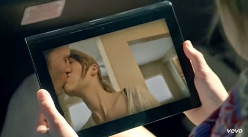
Kissing scene from Taylor Swift video 'Ours'.

Kissing scene in our video inspired by Taylor Swift
scene from 'Ours'.

Lana Del Ray- Video Games

Taylor Swift- Ours

Our music video

Point of view shot from the Taylor Swift video 'Ours'
she is recording her 'boyfriend' in the video.

Point of view shot from our video. Where the female character
is recording the male character. They are both in similar
settings.

We also included intertexuality from scenes in 'Grease'. Grease is a classic romance movie, the scenes are highly recognisable so therefore they would be entertaining to our audience. Despite the fact that it is an old movie, our audience are most likely to be familiar with the movie as they may have watched with their parents when they were younger. 

Scene from Grease where the male character's friend spots the actors love
interest and points her out to his friends, including the main actor.

We did a similar scene but with just one friend. The scene includes the male
character conversing with his friend and his friend points out the female
character.

Opening scene in Grease, where the couple is messing around at the beach.
The male playfully chases the female.

We did a similar scene but at a different location.


Health and Safety/ Risk Assessment Discussion/ Concerns

As our video is about the visuals matching the lyrics we had to assess each scene for any healthy and safety issues. In our chosen song 'Good Girls' there is a lyric which reads " but she sneaks out the window to meet with her boyfriend..." we considered it a risk to have the actress actually sneaking out of a window. She could risk hurting herself by falling out of the window and could potentially cause an injury to the rest of the crew. Which is why she chose for the actress to sneak out of a door instead, which is much more safer. The weather also had an impact on filming. We filmed during dry/ good conditions as we didn't want to risk any of the crew slipping and falling over on a puddle or mud.

Final Music Video

Tuesday, 24 March 2015

Digipak- Draft/ Ideas

This is our rough idea for how our Digipak would look like. We included the front cover, the back cover,  a middle page and a CD. We decided the CD would be kept quite simple as the album back and cover is quite bold. However, we decided that we were going to keep the inside blank with the chalkboard background with the '5 Seconds of Summer' logo.  We want the front cover and the back to be the main focus of our digipak, as it will be the main focus for attracting and appealing to our target audience. 


When we created this poster we thought that it looked quite dull as the background was plain. We didn't feel that it fit in with the rest of our digipak and our video. 


To improve our poster we drew our own doodles, like the album back cover, to create an effective link between all of our digipak. This help our poster relate to the target audience because the doodles as a 'girly', school element. We want our video and digipak to relate to our target audience while also entertaining them. 

screenshot of me creating the advertisement poster
on photoshop. 

Sunday, 22 March 2015

Analysis of Digipak Adverts

Rihanna 'Loud' Album Advertisement Poster


When creating an advertisement poster it is crucial that it links with the CD cover so that the audience are aware that the poster is about the artist's latest album. Some conventions of an advertisement poster includes a large eye catching image, a release date and the song/ album/ artist name. This poster shows a clear link with Rihanna's 'Loud' album. The image is similar to the one on the CD cover, it is a large image of the artist, it focuses on the red tone of her hair and shares the similar pink hue. The font for her name and the album name is also the same and printed out large. There is also a release date including the name of a few single's that was released from the album. The reason why the name of two of her singles is included on the poster is to attract her audience and a secondary audience. If they liked those songs they may enjoy the rest of the album and may purchase it. There is also a picture of album cover on the poster, to show her audience what the album looks like. There is a clear sense of brand identity. 

Katy Perry 'Teenage Dream' Album Advertisement Poster


The poster for Katy Perry's 'Teenage Dream' album fits with the pop genre conventions and appeals to her audience, which is young females. The poster is eccentric, it's colourful, girly and bright. There is a large eye catching image of Katy Perry. The bottom of the poster includes a release date and includes the name of a few singles that was released from the album. This is to attract a large audience, if they liked the songs they may consider purchasing the album. The name of the album is written in bold, white font so it stands out beside the picture. Also, Katy Perry's name is written on top of the album title in her signature font. 

Analysis of 2 or More Digipak (CD Cover)

Rihanna 'Loud' Digipak 

The Digipak for Rihanna's 'Loud' Album fits in with the pop genre conventions and appeals to it's target audience as it is bright, colourful and girly. The digipak features a front and a back cover, tow CDs and a middle page. The front cover fits in with the conventions of a Digipak. These conventions include a large eye catching image, the image relates to the artist or the song and the song/ album title is also found on the front panel. All of these conventions have been included in Rihanna's Digipak. The large eye catching picture on the front is of Rihanna herself, this instantly attracts her target audience. The album title is written clearly and largely on the front and the back of the CD cover. The back also features her image on it. The font is quite simple because the photo is really bright and it's easy to tell that the album is Rihanna's through her photo. The image in the middle includes red roses which matches the artist's hair. There is a continuation and link between the colours, the back cover, the front cover and the middle share the same red toned colour that is similar to the artist's hair and lipstick, there is also a continuation of the pink hue through out. This creates a brand identity as it is recognaisable to her audience and they instantly know it's Rihanna's album if they were to see it on the shelf in a store. 

Taylor Swift 'Fearless' Digipak

The Digipak for Taylor Swift's 'Fearless' album contains a front cover, a back cover, a booklet in side and a CD. This Digipak fits in with the pop genre conventions through mise- en- scene and also appeals to her target audience. The costume within this digipak is bright and she is seen to be wearing dresses throughout. This front cover also fits in with the conventions of a digipak. There is a large eye catching picture on the front, the image relates to the artist or the song and the song/ album title is also found on the front panel. All of these conventions have been included in Taylor Swift's digipak. The large eye catching image is of Taylor Swift. Her blonde curls are prominent in the photo against her white dress and the white background, this is because her curls are her signature look. This creates a sense of brand identity. It also features the name of the artist and the album in bold font. The font that is used for her name is continuously seen throughout the digipak as it creates brand identity. Her audience will instantly know that it's a Taylor Swift album through the use of her signature font and style. 
The back cover includes conventions such as a track list, a record label, artist/ album name, album artwork, extra information and a bar code. This back cover follows all of these conventions. The image on the back cover is of Taylor Swift in an elegant dress with her hair up, this costume is from a music video that she released from this album called 'Love Story'. Her elegant look appeals to her target audience, as her target audience is teenage girls and she looks quite 'girly' and like a 'princess'. It also connotes her public 'good girl' and 'sophisticated' image.
There is also a tracklist on the back to show which songs feature on the album and in what order.
The middle includes a booklet with her song lyrics so that her fans can sing along. This creates a connection between her fans, the album and herself.

Saturday, 21 March 2015

Mise- en- scene

Mise- en- scene is very important within a music video. Through research into the conventions of a pop video, as a group we realised that mise- en- scene is crucial in attracting a target audience. The target audience for our music video is teenage girls, from the ages 13- 19. We also wanted to relate to our audience through our mise- en- scene, which is why location was important when filming our video. We included settings that would be familiar to our audience for example: a school library.

Costume/ makeup:

Costumes in pop videos are usually based on the latest trends. We picked our costume to appeal to our audience. We chose clothing that looked young and stylish and what our audience may wear/ be interested in wearing. The iconic leather jacket through out our video is to connote the pop/ rock genre and the characters 'bad girl' side. She is also seen wearing dark lipstick to make her seem more 'edgy'. The male character is also seen wearing edgy clothes as he is represented as the 'bad boy' in our video. 


To represent the characters 'good girl' side, we changed her costume to a buttoned up blouse and skirt. This is to contrast with her edgy clothes so that the audience can follow the narrative of our music video clearly. When filming her 'good girl' side we stayed within a school location, such as the library, to show that she is a typical 'good girl' who studies. 


Props:

We used props that our target audience is familiar with and can relate with. We did this to keep their focus on the video and the narrative, rather than focusing on an unfamiliar prop. We use props such as sunglasses and a mobile phone. We also included a photo frame, with a picture of the couple inside it, to foreshadow the romantic sub- genre within the video earlier on. 
                                    

photo frame from our music video
mobile phone from our video. The missed- calls from her Mum
is to show the audience her 'bad girl' side that almost every teen
can relate to.

We also used a bandanna for the male character to create a 'bad boy' image for him. This is a stereotypical image for a 'bad boy' and connotes the rock genre within our video. It also creates a link between our video and the band '5 Seconds of Summer', as they are seen to be wearing one in the video.


Camerawork:


We used a range of shots when filming our video. We found out, while filming, that filming in different locations allowed us to experiment with a range of different angles and shots. We used point of view shots when recording the vlogging/ documentary scenes. 


over the shoulder shot in our video so that the audience can see
what she is writing in her book. Although she appears to be
studying, we see that she is actually doodling hearts
in her book.

high angle/ long shot in our video
Editing

When we researched into the conventions of pop videos, we noticed the fast paced editing for upbeat pop songs. We knew we had to include this within our video to create a successful and enjoyable pop video. While editing we made the cutting quite fast and we made sure that the same scenes didn't stay on the screen for too long, which would bore the audience. We also sped up the photos and the ending scene to keep up with the beat of the song. To keep the audience's attention we had to make our video fast paced. We also created a white hue, in our video, to connote the romantic sub- genre within our video.